


Mobile optimisation has never been more important in ecommerce. With 79% of Shopify store traffic coming from mobile devices, how your site performs on a phone or tablet can have a big impact on conversions, sales, and overall customer experience. Today’s shoppers expect fast-loading pages, clear navigation, and a quick, simple checkout experience - and if your store doesn’t deliver, they’ll quickly move on to a competitor.
Shopify comes with plenty of mobile-friendly tools and responsive themes, but simply using the platform isn’t enough. To truly stand out, you need to optimise every part of the mobile experience, from site speed and product pages to navigation and checkout usability. Even small improvements can make a noticeable difference in customer engagement and revenue.
That’s exactly why we’ve put together this complete guide: your go-to Shopify mobile optimisation checklist for ecommerce success.
Why Mobile Optimisation Matters for Shopify Stores
With Google’s mobile-first indexing, it’s your Shopify store’s mobile site that Google prioritises when determining how you rank in search results. Of course, your desktop experience still matters - but it’s your mobile storefront that carries more weight, both for SEO and customer behaviour.
If your site is slow to load, hard to navigate, or just isn’t smooth on mobile, you risk testing your visitors’ patience and losing visibility in search at the same time.
With so many Shopify stores out there, standing out means delivering the best possible experience - mobile experience especially. Here’s why it matters so much:
Higher customer retention
Did you know? More than half of visitors will leave a page if it takes longer than 3 seconds to load. Maybe you do know, or maybe you do it yourself without even realising!
So optimising your Shopify store for mobile isn’t just about making it look good, it’s about making it fast and easy to use. Keeping your load time to under 3 seconds keeps visitors browsing, reduces frustration, and encourages them to return.
A smooth, quick mobile experience also builds trust and keeps both new and returning customers engaged.
Reduced abandoned carts
Ecommerce shoppers are easily distracted, and a slow or clunky site only makes it easier for them to click away or not complete a purchase. If you don’t have a mobile-optimised store, you’re practically inviting abandoned carts.
Ideally, you want to create the clearest, most straightforward path from landing page to checkout so customers can move through your store without any friction.
Better customer experience
As you’ll know from designing your desktop store, customer experience is everything. You’ve probably experienced it yourself: if browsing a site feels like too much work, you just don’t stick around.
If your visitors don’t enjoy shopping on their preferred device, mobile, they won’t do it, and if they’re not looking around, they’re not buying.
Customer experience (CX) is all about how your visitors perceive their time with your brand.
“Everything you do impacts your customers’ perception and their decision to keep coming back or not - so a great customer experience is your key to success.” - HotJar
Studies show that 84% of companies that improve their customer experience see an increase in revenue; and by optimising your store for mobile, you’re hugely improving both CX and sales.
Improved brand perception
If a customer’s first experience on your site is not up to their standards or expectations, they’re unlikely to come back or recommend you to others.
Even if your desktop site is perfect, a frustrating mobile experience sends the message that you haven’t got everything together. Plus, it only takes 0.5 seconds for someone to form an opinion of your brand, and every moment after that either reinforces it or undermines it.
Making sure you have a mobile-optimised Shopify store is crucial for leaving a positive impression.
Increased sales & more Shopify revenue growth
69% of all orders across Shopify stores come from mobile devices.
So without repeating ourselves, it’s clear that a poor-performing mobile presence is going to hurt your conversion rate.
Mobile Optimisation Checklist

✅ Mobile design & layout
Optimising your Shopify store for mobile starts with the design and layout. With less screen space to work with, a cluttered or confusing mobile site can quickly frustrate visitors. Here’s how to get it right:
Responsive Themes
Make sure you research the best Shopify themes so yours is fully responsive - it’s the foundation of a smooth mobile experience! This means your theme automatically adjusts to different screen sizes, so your store looks great and functions properly on phones and tablets.
Or, if you need a custom solution, working with a specialist Shopify agency can help you achieve exactly the look and performance you need.
Simplify Navigation
On mobile, space is limited, so it’s important to keep your navigation clear and easy to use. Don’t overwhelm customers with too many options. Instead, consider using hamburger menus or sticky navigation bars so visitors can find what they’re looking for without endless scrolling.
A sticky navigation bar stays on the screen as users move through your store, making it simple to jump between pages.
Optimise for touch
Mobile shoppers are using their fingers, not a mouse, so buttons and links need to be large enough to tap and spaced out properly. This reduces any unnecessary friction and ensures visitors can interact with your store without accidental taps.
Avoid intrusive pop-ups
Pop-ups can work well on desktop, but on mobile they often get in the way. Make sure any pop-ups you do use are non-intrusive or interruptive, easy to close, don’t block important content or navigation, and are only used for genuinely important messages.
Test Orientation
Mobile users might rotate their devices or browse on tablets, so it’s worth testing your store in both portrait and landscape modes. Make sure your design adjusts smoothly and stays easy to navigate no matter how someone is holding their device.

✅ Site speed & performance
As we mentioned earlier, website speed can make or break conversions. Shoppers are impatient, they aren’t going to hang around, and even a small delay can cause them to drop off or abandon their carts. So, keep your store running fast:
Compress images
Large images can slow your site down, so use WebP, other optimised formats, or tools like TinyIMG to reduce file sizes without losing quality. Smaller images load faster and make the whole site run more seamlessly.
Lazy loading
For images and videos, consider lazy loading. This means content only loads as users scroll, rather than all at once. It keeps your initial load times fast and improves the overall mobile experience.
Minimise JavaScript and CSS
Extra scripts and heavy CSS can slow down your mobile site. Keep things lean by minimising JavaScript and CSS using tools like Minify so your pages load efficiently and run without hiccups.
Use Shopify’s built-in caching and CDN
Take advantage of Shopify’s built-in caching and CDN features. These tools help deliver your content faster by storing copies closer to your customers, reducing load times no matter where they are.
Mobile speed testing
Always check, double-check, even triple-check your mobile performance! Tools like Google PageSpeed Insights or GTmetrix can highlight slow areas and give actionable tips to fix them. Regular testing ensures your store stays fast as you add products and updates.

✅ Checkout optimisation
The checkout is where browsers become buyers - and on mobile, there’s little room for obstacles. Here’s how to make your Shopify checkout mobile-friendly and keep customers moving toward purchase:
Mobile-Friendly Checkout Pages
Your checkout pages need to be fully mobile-friendly. Forms should be easy to read and simple navigate on a small screen, so customers can complete their purchase, ideally in just one page.
Autofill for Forms
Enable autofill wherever possible. Letting customers fill in addresses, emails, and payment info quickly reduces the amount of time they have to spend typing and makes checkout feel effortless.
Enable Mobile Payment Options
Offer payment options like Apple Pay, Google Pay, and Klarna. Mobile shoppers love having choices and the ease of one-tap payments.
In fact, 70% of consumers say that the availability of their preferred payment method plays a crucial role in where they choose to shop online.
Plus, giving them these options makes checkout faster and helps reduce abandoned carts.
Reduce Steps in the Checkout Flow
Keep the checkout process short and simple. Every extra step gives shoppers a chance to rethink their purchase, so remove anything unnecessary and make it as straightforward as possible.
Clear CTA Buttons
Call-to-action buttons are super important, especially on mobile where space is tight. But try not to clutter the screen with too many options. Instead, stick to one clear action per page so people know exactly where to tap. Clear, noticeable buttons guide users through the checkout and will increase sales.

✅ Content & UX
Your content and overall user experience (UX) on mobile play a huge role in keeping visitors engaged. You need to think carefully about fonts, layout, and how information is presented on mobile. Here’s what to focus on:
Readable Fonts
Fonts that look fine on desktop can be a struggle or feel tiny on a phone. While size 12 used to be standard, experience shows that 14–16px works much better for mobile. Just keep in mind that bigger fonts can affect your layout, so adjust surrounding elements to keep everything looking balanced.
Short, Scannable Text
Mobile users aren’t going to sift through walls of text. Keep paragraphs short, use numbered or bulleted lists, and sprinkle in visuals or videos to add variety.
“Because Google’s search results are based on the mobile site, you want to keep all of the information you have on your desktop site on your mobile site.” - TinyIMG
The key is to present it in a way that’s easy to scan on a small screen.
Avoid Horizontal Scrolling
Horizontal scrolling on mobile is a headache and can easily make visitors bounce. Keep your layouts clean, responsive, and designed to fit comfortably within the screen width.
Mobile-Friendly Product Pages
Product pages are where the magic happens. Here, images should load fast, descriptions need to be easy to read, reviews front and center, and CTA buttons big enough to tap without much effort.
Optimise for Mobile SEO
Don’t forget that Shopify mobile optimisation and SEO go hand in hand. Your meta tags, headings, and structured data should all be set up properly on your mobile site to help Google index and rank your store.

✅ Images & Videos
Images and videos are key to showcasing your products, but on mobile, they need to be handled carefully to avoid slowing down your store or making it feel awkward to use. Let’s break down the best ways to handle them:
High-Quality, Optimised Images
Not all Shopify themes handle images perfectly on mobile, so improperly sized images can throw off your layout. Use responsive images wherever possible as these automatically adjust to fit the screen they’re on. You can also set a minimum size range and the image will resize itself for the best fit.
At the same time, keep file sizes in check so your pages load quickly. We recommend JPGs under 29KB and PNGs under 16KB. Mobile-optimised images mean faster loading times and a smoother browsing experience.
Videos
Videos can increase engagement, but on mobile they need to be lightweight and efficient. Disable autoplay so they don’t slow down your page, and make sure they don’t break your layout. Videos should enhance the shopping experience, not get in the way.
Zoom-In Features
Mobile shoppers often want to see product details up close. Implement zoom-in features carefully so users can inspect images without breaking your page layout or causing scrolling issues.

✅ Testing & Analytics
Optimising your Shopify store for mobile doesn’t stop at design and speed - you need to test and track to see what’s really working. The best way to approach it is to:
Test on Multiple Devices
Mobile comes in all shapes and sizes. Make sure to check your store on iOS, Android, and tablets to ensure it looks good and works smoothly across all devices.
Track Mobile Conversions Separately
Use Shopify analytics to track mobile conversions separately from desktop. This helps you identify where mobile users are dropping off and which pages or products perform best on smaller screens.
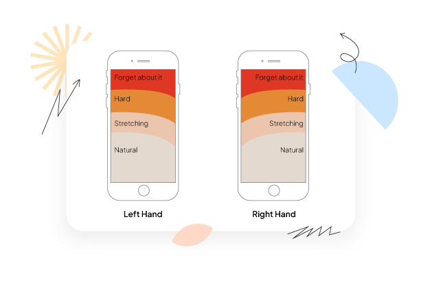
Use Heatmaps
Heatmaps show how users interact with your mobile pages. On desktop, it’s mostly about where the eyes are drawn - but on mobile, thumbs matter too. Buttons need to be big enough to tap and spaced far enough apart to avoid accidental clicks.
If you look at the example below, you’ll see the areas your users can naturally reach while browsing your store. Anything in the top or bottom corners will most likely be awkward, and therefore, impact your customer’s experience.

However, that research was posted in 2016 and as you may have noticed, screen sizes have grown over the last few years. Therefore, Whide Group made an improved model based upon modern screen sizes. So, in general, it’s best to keep buttons and navigation near the centre and toward the bottom.
Anything out of that zone won’t be ignored, but if your customers are continually having to stretch or move to meet your website’s demands, they’re going to leave eventually.
A/B Testing
Finally, don’t forget to A/B test mobile layouts, CTAs, and banners. Testing different variations helps you understand what drives engagement and conversions, and lets you continuously improve your mobile experience.
.webp)
✅ Get a mobile app for your Shopify store
If you want to meet your customers where they’re already spending their time, a Shopify mobile app is the best solution. Here’s why:
Push notifications to reduce & recover abandoned carts
Shopify mobile apps make checkout simpler and quicker, helping reduce abandoned carts. Plus, push notifications let you reach and re-engage customers who left items behind instantly - no risk of emails getting lost in spam. In fact, push notifications have a 10x higher open rate than emails.
Built for mobile
Everything we’ve suggested for optimising your mobile website is built into mobile apps automatically. They’re designed specifically for mobile, so your store runs seamlessly already.
No developer needed
You don’t need coding knowledge or a developer to get started. With no-code Shopify mobile app builders like StoreLab, you could have your store’s app up and running in as little as a month.
Better engagement and sales
With 88% of mobile time spent in apps and dedicated mobile commerce apps accounting for 54% of mobile commerce payments, having your own app isn’t just an extra bonus, it’s now a key as a powerful way to boost sales and engagement. You’re meeting customers exactly where they want to be and giving them the best possible experience.
To learn more about getting a mobile app for your Shopify store, get in touch with a member of our team at StoreLab. Need convincing further? Read our article, Shopify Mobile Apps vs. Mobile Websites: What Drives More Revenue?
✅ Bonus Tip
Accelerated Mobile Pages (AMP) can make your Shopify store load almost instantly on mobile. By streamlining your pages, AMP keeps things fast and smooth, which is great for user experience and improving your SEO. It’s especially useful for content-heavy pages like blogs or product guides, helping keep mobile visitors engaged instead of leaving.
Looking for more ways to grow your Shopify sales?
If you’re looking for more ways to maximise your ecommerce success, you’re in the right place. Our Shopify growth experts are here to help you skyrocket your sales, increase AOV, boost customer retention, and more!
Get in touch with our team at StoreLab today to learn more about how we can help your business grow to new heights through Shopify mobile apps, Meta ads, and creative services.

Skyrocket your Shopify sales with a no-code Apple & Android mobile app. Available now on the Shopify app store.


.webp)
