

Did you know that website design influences 94% of first impressions?
When you're running a Shopify or Ecommerce store, that first glance can be the difference between someone bouncing or making a purchase.
In this guide, we’ve handpicked 20 standout fashion, jewellery, and health & beauty stores that get it right when it comes to design, user experience, mobile-friendliness, and brand storytelling. Each one highlights a unique design idea you can steal (ahem, get inspired by) for your own Shopify website design.
Whether you’re launching a new business or looking to refresh your current site, these examples are filled with practical tips and creative ideas to help you elevate your online presence.
1. Engaging landing pages with full-screen hero images
A full-screen hero image is a great way to grab your visitors' attention right from the start. And with the top 10% of landing pages pulling in nearly 80% of the traffic, you’ll want to make sure yours really makes an impact.
By using bold, high-quality visuals that fill the entire eyeline on your main landing page, you can create an immersive first impression that tells a story before a single word is read.
Especially in fashion, jewellery, and beauty industries, where aesthetics matter, a stunning hero image can hugely increase engagement and encourage visitors to explore your store further.
Design Example: NEOM Wellbeing London

Wellness brand NEOM is a perfect example of an engaging landing page with a full-screen hero image. They’ve got lifestyle and product shots, their brand values, a "find your feel good" message, and a clear benefit for their audience - all packed into one eye-catching banner. It’s simple, but smart, and definitely not overcomplicated.
2. Simple, clear, & clean navigation
Your website’s navigation menu is one of the first things visitors interact with - it acts like the roadmap that guides them through their shopping journey.
Since users spend only about 6.44 seconds on a navigation menu, clarity is key. A simple, easy-to-follow navigation helps shoppers find what they need fast, keeping things smooth and making them more likely to keep browsing.
On the flip side, a clunky or confusing menu can totally overwhelm visitors, and over 40% of them will bounce before even checking out your products.
Clean navigation is more than just a design choice, it’s actually key to keeping shoppers around and boosting conversions.
Design Example: Mauvais Modern Menswear

Men’s clothing brand Mauvais shows how keeping it simple can be super effective for navigation on your Shopify website design. Their menu sticks to just four main categories: New In, Mens, Our Story, and Special Offers. And when you drop down into those, everything’s nice and clear; no fuss, just smooth and easy browsing.
3. Minimalist product pages
Minimalist product pages strip away distractions and put the focus exactly where it should be - on the product itself.
By using ultra-clean layouts, generous white space, and including only the essential information, these pages can create a site that feels effortless to navigate.
For fashion, jewellery, and beauty brands where visuals sell, this approach lets product photography shine and helps customers appreciate the details without feeling overwhelmed.
A minimalist design looks sleek and modern, but also helps boost conversions by making it easy for shoppers to focus, decide, and buy.
Design Example: MISSOMA Jewellery

Take inspiration from jewellery brand MISSOMA’s ring product page. It has all the key info and filters customers need to find exactly what they’re looking for, but keeps everything nice and simple.
The images are clear, with colour swatches, product details, and price all laid out, plus you can easily swipe over the product image to see a lifestyle shot. It’s a great way for customers to focus on the details they care about - the perfect example of a product page that’s informational, but still minimalist.
4. Showcasing brand personality and values
With all the competition out there, adding your brand’s personality to your website is a great way to stand out. By aligning your site’s design, imagery, and tone of voice with your products and values, you create a strong, authentic identity that resonates with people.
Even the smallest, thoughtful choices - like colour schemes, typography, images, and powerful, emotion-driven copy - can have a big impact. When you align your visuals and messaging with the feelings you want to evoke, you create stronger connections with your customers and make your store instantly appealing.
Design Example: United By Blue

Shopify store United By Blue is a clothing, tools, and accessories brand that's known for sustainability and ethical practices. Their website does a fantastic job of showcasing their products, values, and mission all in one place.
For example, they highlight their unique initiative where every product purchased equals 1 pound of trash removed from waterways.
The key here is not just having a page dedicated to your mission (which is also important), but weaving it into the overall design of your store - this way, people can connect with your brand and products as they shop. In fact, 77% of consumers are more likely to buy from brands that share their values.
5. Highlight user-generated content (UGC)
Did you know 86% of people consider customer reviews a must for making purchase decisions?
User-generated content (UGC) is an incredibly effective way to build trust and authenticity on your site through customer thoughts and opinions.
Featuring real customers styled in or using your items, such as in product pages or galleries, also helps potential buyers see how your items come to life in everyday scenarios.
UGC offers social proof, showing potential buyers that others love your brand - and it can really influence their decision to buy. When it’s smoothly integrated into your site design, it makes visitors feel more connected to your brand and increasing the chances they’ll convert into customers.
Design Example: LUMENE Beauty

LUMENE beauty has nailed it by adding a social commerce and TikTok feed right onto their homepage. Customers can see real people using and loving their products, which builds trust, creates some FOMO, and encourages them to buy.
The feed shows a mix of people, products, looks, and reviews, so everyone can find something or someone they connect with.
Basically, LUMENE is letting their happy customers do the selling for them, so adding this to their Shopify website design was such a smart move.
6. Floating navigation menu
Floating or sticky navigation menus stay fixed at the top of the page as customers scroll, so they can easily and constantly access key sections of your site without having to scroll all the way back up.
This sleek design feature keeps the shopping experience seamless and efficient, allowing users to quickly jump to different categories or pages no matter where they are on the site.
A floating menu enhances usability, makes your site feel modern and user-friendly, and speeds up navigation for your customers - no more endless scrolling.
Design Example: Oh Polly Clothing

In the example above, I’m on the homepage of the Oh Polly website. No matter how far I scroll, the navigation menu stays right where it is.
This is great for customers who want to get a feel for the site before diving into the menu.
For instance, if they spot a dress they like in a lifestyle shot, they can easily jump to the dresses collection without having to scroll all the way back up or hunt for it. It might seem simple, but it’s super effective for the user experience (UX).
7. Immersive ‘about pages’
An immersive ‘about page’ goes beyond just a block of text about your company, it’s a chance to tell a story that connects your brand’s roots, mission, and values with your audience in a way that really resonates.
With visual storytelling (think impactful images, videos, or interactive elements) you can create an emotional connection that helps visitors really feel why your brand exists.
This approach also differentiates your store from competitors by humanising your Shopify store and highlighting what truly makes you unique.
Design Example: Ana Luisa Jewellery

What’s special about Ana Luisa Jewellery’s ‘about page’ is that it goes beyond the usual. It’s not just one page - it’s broken down into different sections: about the jewellery, the company, their partners and people, and even their commitment to the planet.
It shows they’re open and transparent, wanting to engage customers on their products, brand story, mission, and values. Definitely a good store to look to for inspiration if you want to build a more loyal customer base.
8. Showcasing sustainable & ethical practices
Today’s shoppers are more aware than ever about how their purchases affect the planet and society. In fact, 63% of Gen Z shoppers prefer to buy from brands that care about sustainability, and 73% of consumers overall are willing to pay more for products from eco-friendly brands.
Brands that highlight their sustainable and ethical practices, like using eco-friendly materials, offering vegan products, being cruelty-free, or committing to fair labor practices meet the growing demand and also build trust with their audience.
By showcasing these values on your website, you create transparency and align your brand with customers who prioritise ethical choices. This kind of commitment can build loyalty, attract like-minded consumers, and set your brand apart in a competitive market where conscious consumerism is on the rise.
Design Example: GOT BAG

GOT BAG is a Shopify store that’s renowned for selling the world’s first backpack made from ocean-impact plastic. Their website, especially the ‘about page’, really focuses on how their products come to life, along with key info about the brand and their mission.
It’s more than just a simple block of text - you can actually click into different parts of the brand’s mission to get a deeper look at the GOT BAG story and their dedication to ethics and sustainability.
9. Upselling & cross-selling
Upselling and cross-selling are effective techniques that encourage customers to spend more by suggesting products that go well with what they’re buying or offering something of higher value.
Whether it’s with “You Might Also Like” suggestions, “Shop The Look” features, or product bundles, these strategies seamlessly integrate into the shopping experience.
For fashion, jewellery, and beauty brands, this could mean suggesting matching accessories, related products, or even offering a little discount when customers buy a bundle.
This way, you grow your Shopify sales and boost your average order value (AOV), all while making the shopping experience even better by helping customers find more things they’ll love.
Plus, recent studies show that 72% of businesses use upselling and cross-selling to bring in around 30% of their revenue - so it really works.
Design Example: FASHION NOVA

One brand that does upselling and cross-selling really well is clothing store FASHION NOVA. They’ve added a “You Might Also Like” feature just below the product details, in this case, for a pair of jorts. Clicking it opens up a section where you can easily browse and add other/similar products to your basket.
10. Adding trust signals
First impressions are everything - even more so in ecommerce, where customers can’t physically see or touch the product. Visitors decide in just a few seconds whether they trust your store or not, and that’s exactly where trust signals come into play.
These key elements, like customer reviews, quality assurance badges, secure checkout icons, and free shipping offers, reassure visitors about your brand’s credibility and reliability.
What's more, 76% of customers are more likely to buy when they see a safe checkout badge.
Adding trust signals above the fold (right at the top of your site) or in spots like the footer, product pages, and checkout can build customer confidence. It helps ease hesitation and can lead to more conversions, and more Shopify revenue growth in the long run.
Design Example: Silver Origins Jewellery

Take Silver Origins, for example - a Cornish jewellery brand that specialises in sterling silver pieces. They do a great job of showing trust signals, like product authenticity, right in the footer. That kind of reassurance is super important for jewellery stores, especially smaller or handmade ones like theirs, where new customers are looking for signs to trust you.
11. Well timed & designed popups
When they’re done right, Shopify popups can be a super effective way to grab attention, grow your email list, or share special offers, without annoying your visitors.
The trick is all in the timing and design: a sleek, on-brand popup that appears at just the right moment (like when someone is about to exit or after they’re spent time browsing)) feels helpful rather than intrusive.
A good popup should add to the shopping experience by adding value, not interrupt it.
Maybe you’re offering a discount for signing up to your newsletter, highlighting a sale, giving 10% off first orders, or showing off a new collection - it’s all about offering something useful, not just popping up for the sake of it.
Design Example: Hiya Health

Hiya Health is a kids' health and wellness brand hosting a variety of products and vitamins to help boost immunity and build stronger little bodies. They place a huge focus on attracting loyal, high-quality customers and genuinely care about the families using their products.
That’s why their popup is so spot on - it’s valuable, clear, well-timed, and hard to miss. You get 50% off your first order and free shipping just for signing up to their newsletter. Win-win for both the brand and the customer.
12. Checkout Optimisation
Optimising your checkout page is crucial if you want to turn browsers into buyers and reduce Shopify abandoned carts.
A streamlined, one-page checkout with multiple payment options, clear delivery choices, upsells & cross-sells, and visible trust signals creates a faster, smoother experience that keeps customers from dropping off at the final hurdle.
Especially when you offer multiple payment options - like credit cards, PayPal, digital wallets, and even buy-now-pay-later services - it gives shoppers the flexibility they want and can really help increase completed purchases.
In industries where impulse buys are common, removing friction at checkout can make all the difference.
Design Example: CLUB L London

Check out Club L London’s one-page checkout. It’s got everything; multiple payment options, guest checkout or login, different delivery choices, no hidden fees, and more. This kind of streamlined checkout ensures customers can buy quickly without the hesitation that can lead to Shopify cart abandonment.
13. Commitment to customer service
One of the most underrated ways to see more Shopify success is by viewing great customer service as more than just a support feature. It’s actually a big part of your brand’s identity and a powerful way to build trust with your customers.
Shoppers want to feel sure that if they have a question, need more info, or run into an issue, getting help will be quick and easy.
By adding things like live chat, clear contact options, easy-to-find FAQs, and generous return policies to your Shopify website design, you highlight your commitment to customer care and set your store apart from the rest.
93% of shoppers are more likely to make repeat purchases with companies who offer excellent customer service, and 78% of consumers will still do business with them again after a mistake if the customer service is great.
Design Example: Gymshark

Gymshark is an apparel brand where customers often have questions about fit, style, or use, so great customer support is important and can turn hesitation into confidence and first-time buyers into loyal customers.
Their AI-powered chatbot, combined with human support, is seamlessly integrated into their Shopify store, offering instant help whenever and wherever customers need it.
14. Product page video integration
Adding video to your product pages is the best way to bring your products to life and give customers a closer, more dynamic look at what they’re about to buy.
Plus, 66% of consumers said they would prefer to watch a short video to learn about a product.
Whether it’s a model showing how clothes or accessories really look, a close-up of jewellery details, or a demo of a beauty product in action, video helps answer the questions that photos alone can’t.
This added layer of visual storytelling builds trust and gets people more engaged and confident in their purchasing decisions, especially in industries where things like texture, fit, or finish matter.
Design Example: ASOS Fashion

ASOS is known for their well-designed, detailed, and user-friendly product pages. They also do a great job with video integration on their product pages, like the example above.
Customers can see how these trousers look in real-time, how they move, and get a better sense of things like length and texture, which you wouldn’t be able to see just through static images.
15. Colour swatch options & virtual try-on tools
Giving customers the ability to see products in different colours or try them on virtually brings in a layer of interactivity that makes the shopping experience feel more personal and engaging.
Colour swatches let shoppers quickly view how an item looks in each variation, while virtual try-on tools (especially useful for jewellery and beauty products) help customers visualise how the product will look on them.
Including features like these on your site not only helps cut down on returns by setting clearer expectations upfront, but also shows that you genuinely care about making the shopping experience as smooth and enjoyable as possible.
Design Example: KYLIE COSMETICS

KYLIE COSMETICS lip kits weren’t just a 2016 trend - they’re still going strong today, and a big part of that is down to how their product pages have evolved.
You can browse colour swatches across different skin tones and even try shades on virtually, right then and there.
When customers can see if something suits them before hitting “buy,” it makes shopping feel a lot more interactive, and gives way more confidence. It’s a solid example of a product page done really well.
16. Recently viewed products feature
Adding a “Recently Viewed” section helps shoppers easily return to items they’ve shown interest in, without needing to search all over again.
It’s a small but effective feature that keeps the browsing experience smooth and stress-free, especially when people are comparing multiple items and want to easily revisit what caught their eye.
This kind of convenience and personalisation (that 71% of consumers actually expect) works to keep users more engaged and increase conversions per customer by resurfacing products they may have otherwise forgotten about.
Design Example: HELLOMOLLY

One standout feature on New Look’s website has to be their ‘Recently Viewed’ section. It adds a personal, helpful touch by keeping track of everything you’ve browsed - whether it was a few minutes, days, or even a week ago.
It’s perfect for those moments when you forget to save something or didn’t add it to your basket, no need to dig around or search again. Plus, it gives shoppers that little reminder nudge that often leads to a purchase.
17. Strategic sale highlights
A well-promoted sale can do more than just grow Shopify revenue, it can also build anticipation and re-engage returning visitors. Whether your promotion is happening now or coming soon, it’s important to highlight it clearly across your website so no one misses out.
Using banners, popups, countdown timers, or even homepage messaging like “Get your basket ready!” can spread the word and drive action. Making your sale impossible to miss keeps customers in the loop, builds excitement, and adds that little nudge of urgency.
Design: Catbird Jewelry

Catbird makes stunning, trendy, and ethically sourced fine jewellery, and they’re a perfect example of promoting their sales in all the right ways on their website, in this case for Shopify Black Friday Cyber Monday.
They’ve got their sale highlighted across the site, from the navigation bar to popups, homepage banners, and more. It’s not just about letting visitors know there’s a sale, but also giving them a clear idea of what to expect and adding some urgency with their messaging to get shoppers moving.
18. Consistent button styles & clear CTAs
CTA buttons are one of the most crucial elements in your Shopify store - they help guide visitors, shape their experience, and ultimately lead them to make a purchase.
But if your buttons are styled inconsistently or use unclear wording, it can create some visual clutter and make visitors question the reliability of your site.
Keeping your buttons consistent in color, shape, and placement, with clear, action-driven text like "Add to Cart" or "Shop Now," makes everything feel more seamless and easy to navigate.
Design Example: QALO Jewelry and Accessories

QALO is an American jewellery and accessories brand that’s all about creating wedding and commitment rings from silicone instead of traditional metal. But what really stands out on their website is their branding.
The use of bold, unique colours, especially that lime green for all the CTAs, makes it clear for customers to spot where to click. It’s a clever Shopify website design choice - the black, white, and green combo really makes those buttons pop.
19. Editorial style photography
Blending lifestyle imagery with product shots gives your store a high end, editorial feel that can instantly elevate your Shopify store.
These shots make your website look amazing, but also elevate your entire brand because you can repurpose them across your socials, ads, emails, marketing materials.
Instead of relying solely on the standard product photos, mix it up with some styled, story-driven visuals - like a model wearing your jewellery or clothing in a real-life setting or a beauty product being used mid-routine. It helps shoppers picture how the product will fit into their own lives.
Design Example: SEAFOLLY

Swimwear brand SEAFOLLY have always been known for their chic, on-trend editorial photography across their website, social media, and marketing materials. Right now, they’re making the most of the summer shopping season by styling their products for the beach and holidays, with models showcasing the pieces.
This way, customers can imagine themselves in those summer moments and feel the excitement. Plus, they might want that same holiday aesthetic as the models in the photography.
20. Mobile-friendly design
With over 79% of Shopify traffic coming from mobile devices, having a site that works flawlessly on smaller screens isn’t optional, but essential.
A mobile-first design ensures that your store is fast, easy to navigate, and visually clean on smartphones and tablets, not just desktops.That means buttons should be thumb-friendly, text should resize smoothly, and product images should swipe effortlessly.
You can also boost the mobile experience by promoting your Shopify mobile app directly on your site - and sweetening the deal with an incentive like 15% off a first app order.
Don’t have a mobile app for your Shopify store? It’s worth considering, especially if you want better performance and deeper engagement with your customers through tools like push notifications. Learn more.
Design Example: Airebil Apparel

Check out Airebil Apparel’s mobile site above, it’s a great example of how to do mobile right.
Everything resizes perfectly from desktop without feeling squished or overwhelming. It’s clean, super easy to scroll through, and keeps all the key features from the desktop version, just made totally mobile-friendly.
Plus, they’ve cleverly added a popup promoting their Shopify mobile app, with a tempting 20% off your first app order.
Final thoughts
We hope that this guide has given you the inspiration you need to create or update a beautiful, user-friendly, and high-converting Shopify or ecommerce website.
Don’t forget, even small tweaks can make a big difference, so keep testing, refining, and most importantly, building a site your customers will love to shop from. Discover 6 Simple Steps to Improve Shopify Website Design. (Blog link)
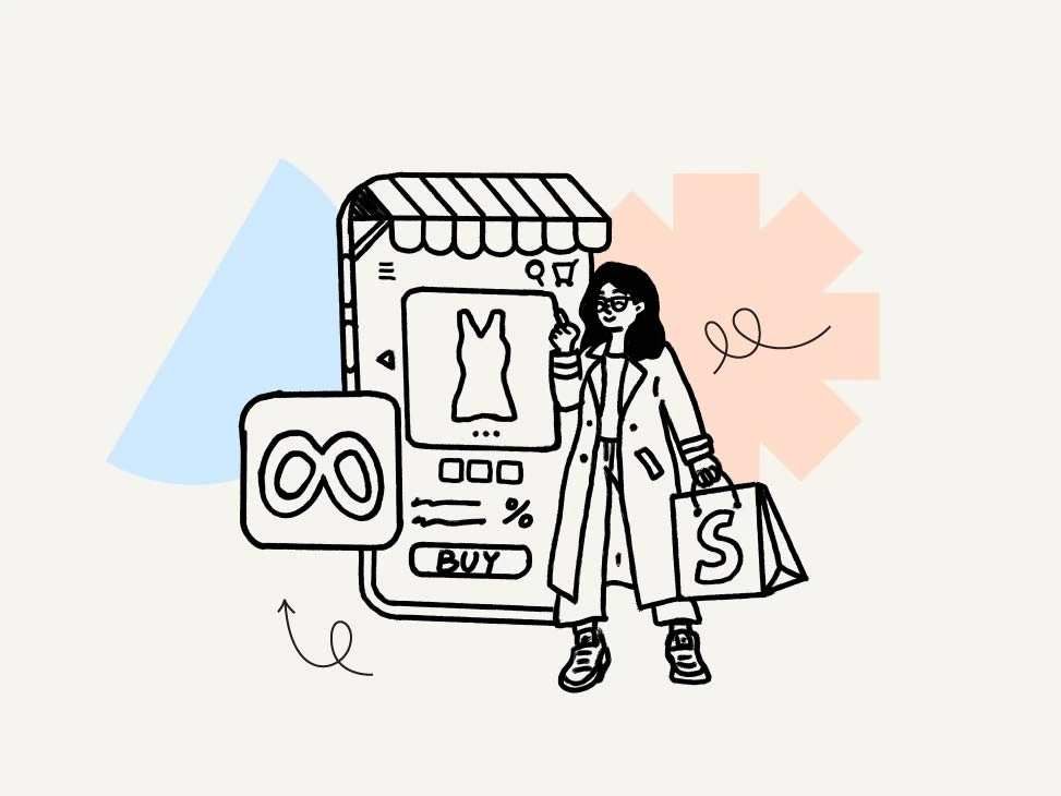
If you’re looking for more unique, but effective, ways to take your Shopify store to the next level, then consider partnering with a Shopify Growth Service like StoreLab. Here’s how we can help:
- Shopify Mobile App Builder - Having a dedicated mobile app ensures a smooth shopping experience, with 60% of consumers preferring them to mobile sites. Features like push notifications, in-app recommendations, and seamless checkout help boost customer loyalty and increase AOV.
- Meta Ads Service - Our expert team handles everything you need for successful Meta ads, from strategy to setup and ongoing optimisation, ensuring your brand reaches the right audience and drives high-quality traffic.
- StoreLab Accelerator Program (SAP) – Get one-on-one expert coaching to help you scale your Shopify store quickly and effectively with a solid business model for sustainable growth.
If you’re serious about seeing more Shopify revenue growth, now is the time to test new strategies and seek expert support. Chat with one of our friendly experts today to learn more!

Skyrocket your Shopify sales with a no-code Apple & Android mobile app. Available now on the Shopify app store.


.webp)
